MENU
ホーム
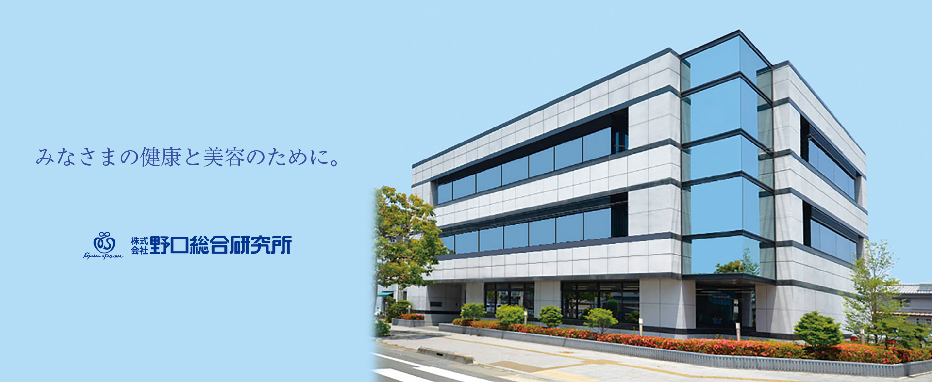
企業情報
ごあいさつ
概要・沿革
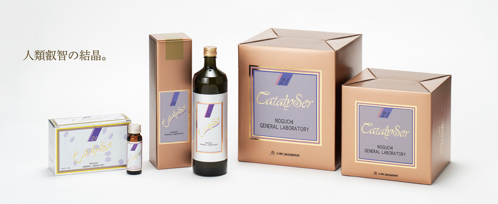
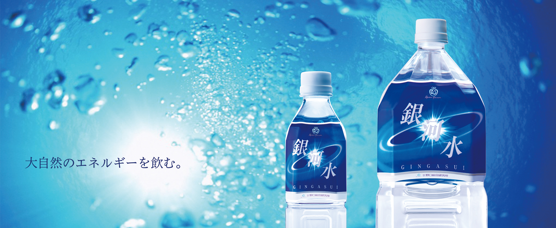
商品情報
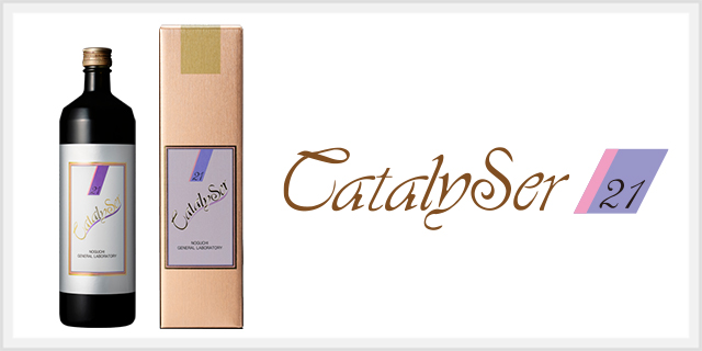
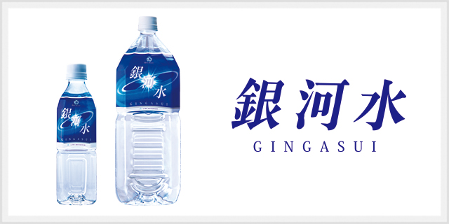
ドリンク
サプリメント
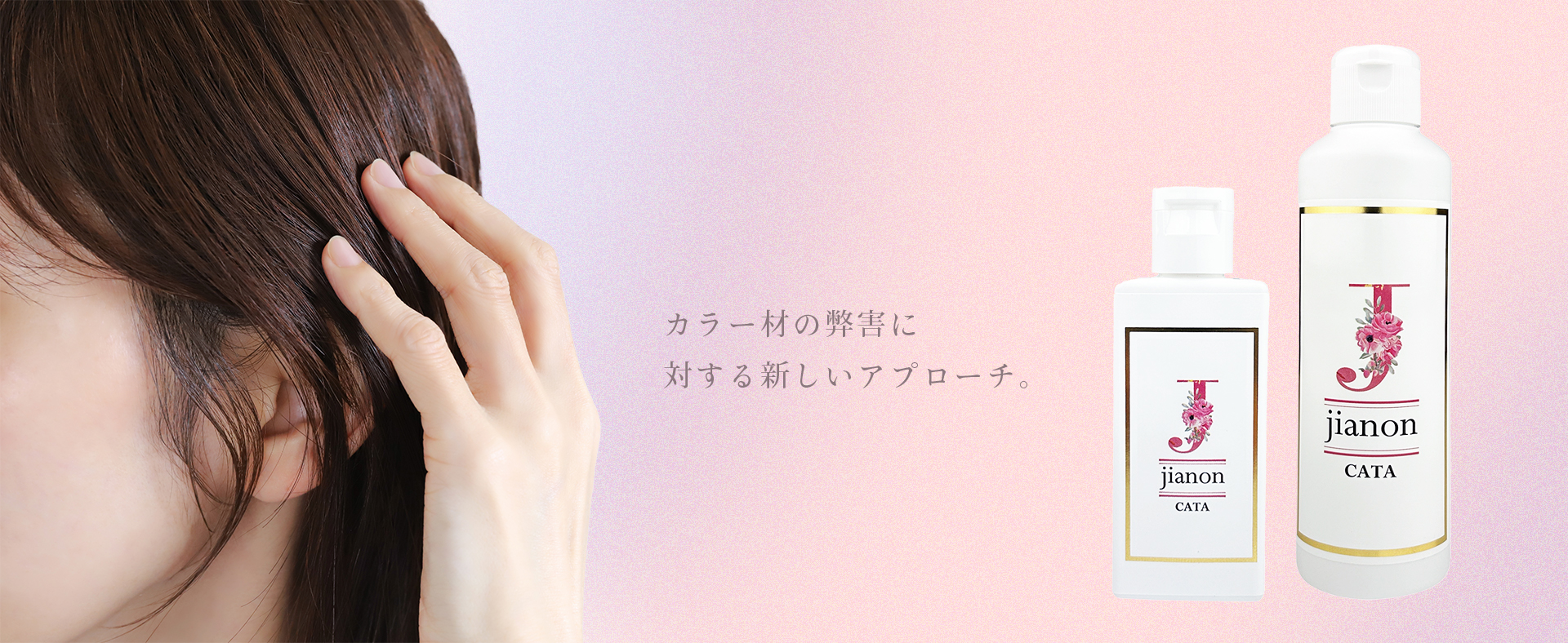
ビューティケア
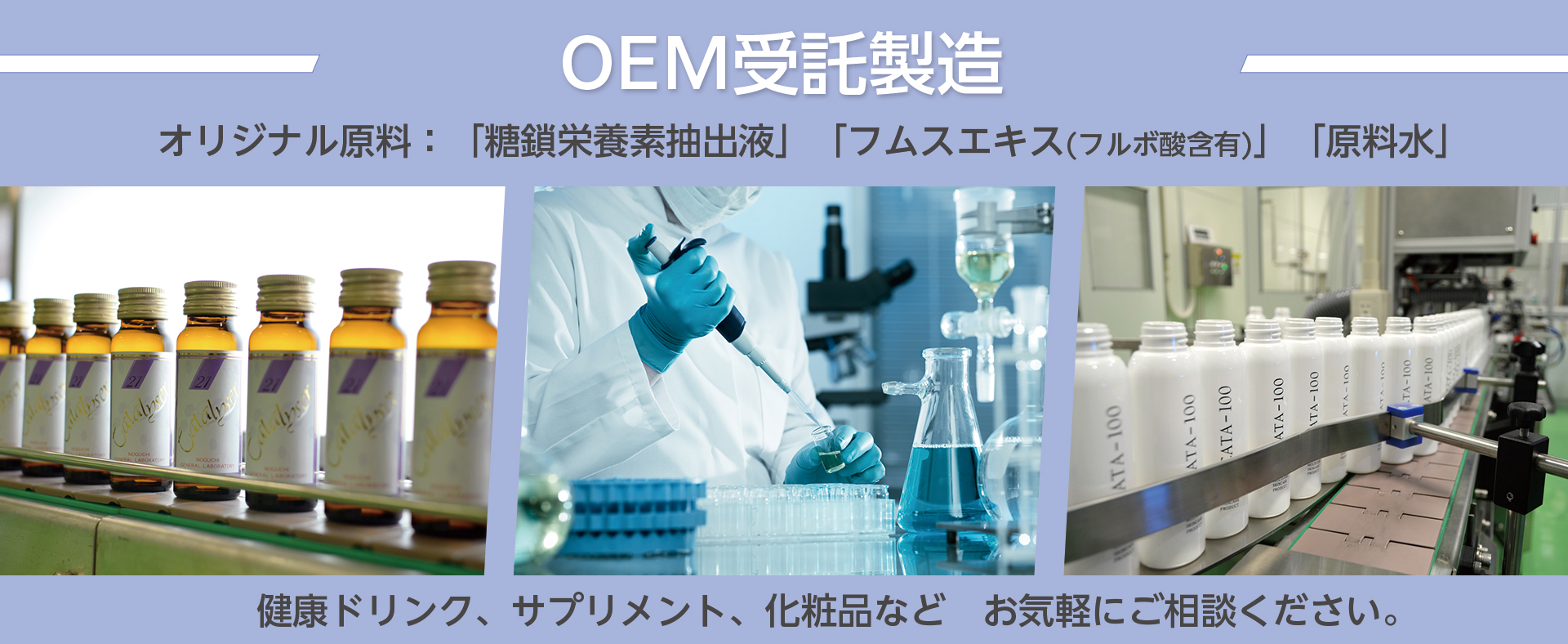
原料・OEM
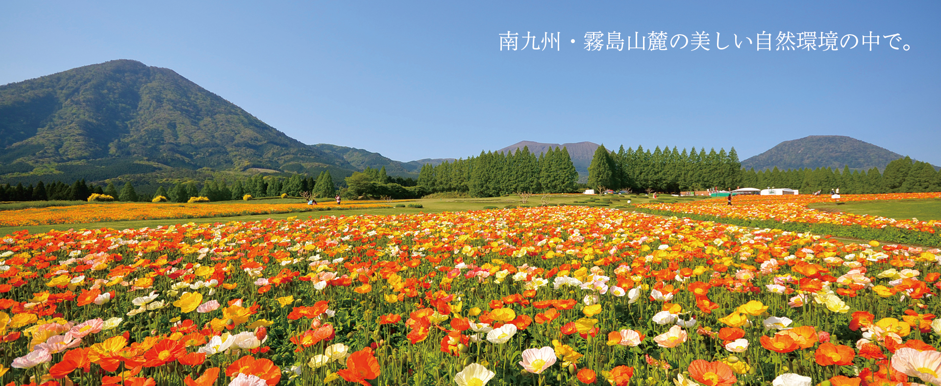
工場紹介
小林工場
生駒工場
お知らせ
お問い合わせ
採用情報
主な商品
新着情報
新着情報一覧
九州大学と共同特許を取得しました
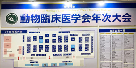
第44回動物臨床医学会 出展
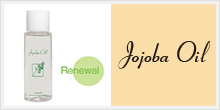
ホホバオイル リニューアル
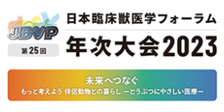
日本臨床獣医学フォーラム年次大会2023 出展


